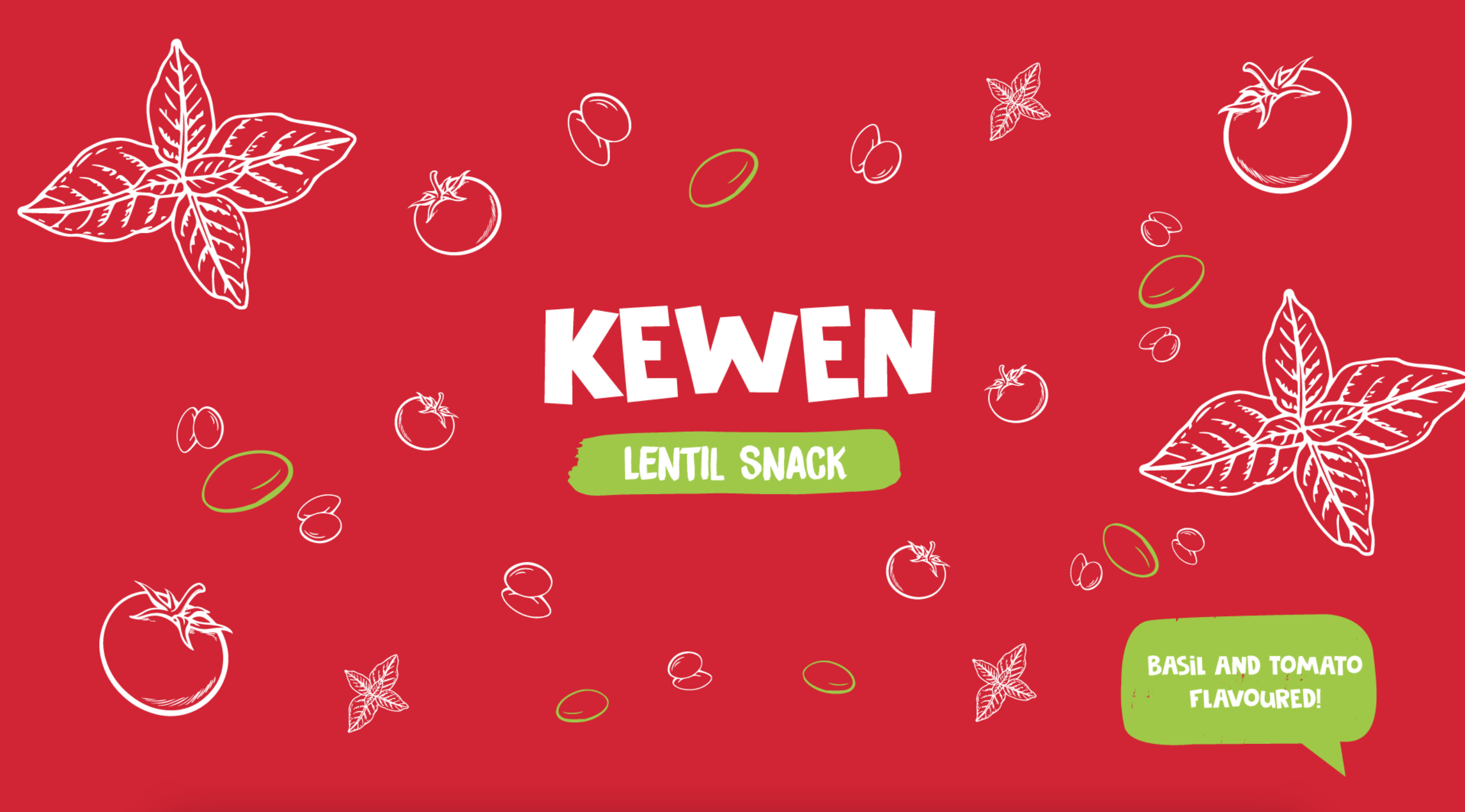
KEWEN

After evaluating Flex’s competition, we decided to design a logo with a high emphasis on the company’s name "FLEX” as it would straighten out the branding process. Furthermore, since the competition is high, using the name within the logo allows people to recognize and remember it well. Based on these ideas, we used relevant shapes and elements to indicate the reliability and quality of the brand’s service. As for the colour palette, our team used bright and vibrant colors, which could also be utilized as the brand’s colours in their future marketing and branding campaigns. We paid a lot of attention to the noticeability of this logo. Every aspect from branding their stationery and vehicles to billboard marketing campaigns were considered when choosing colors.
Services

Project Brief

Requirement

On top of displaying the healthy and organic aspects of their products, they were also keen on simplicity. Since they appeared to be very fond of their brand name, we placed more emphasis on it when designing the logo. Moreover, the company wanted the same product characteristics to follow into their branding campaign as well and therefore, we had to bring their story and products alive when designing elements for this campaign. 

Designing

For this project, we handled everything candidly as per the client’s request. Our team created an exclusive font for the logo and moved on to the next challenge, which was to convey the branding to their packaging. Since the logo was done entirely with typography, we decided to use elements with contrasting shades of colours for the product description. We managed to design posters for each flavor, which were largely inspired by the package designs. 

In this project, we wanted to keep everything simple as per the client’s request. So we created an exclusive font to do the logo. And the next challenge is to take the branding to their packaging. Since the logo is fully done with typography we decided to use elements from the product description with contrasting shades of colors. We were able to design posters for each flavor, and they were inspired by the package designs