Positioning & Requirements
Poland Pet Care’s target maret was working professionals with pets. Such people would want good and trustworthy carers for their pets while they’re away. The client’s main focal point was conveying that atmosphere to their customers through the logo. Therefore, we had to figure out a way to portray emotions like love and care via the design.
This company had some prominent competitors, some of whom had been in the business for several decades. Therefore, our team had to work knowing that it was a major challenge to claim their position in the market. Nevertheless, we brainstormed ideas for the branding campaign, including the logo.
Execution
It was a few days before we finalized a logo idea because there were some exigent demands. Three aspects were prioritized when designing the logo.
- Feelings/Emotions
- Competition
- Target Market
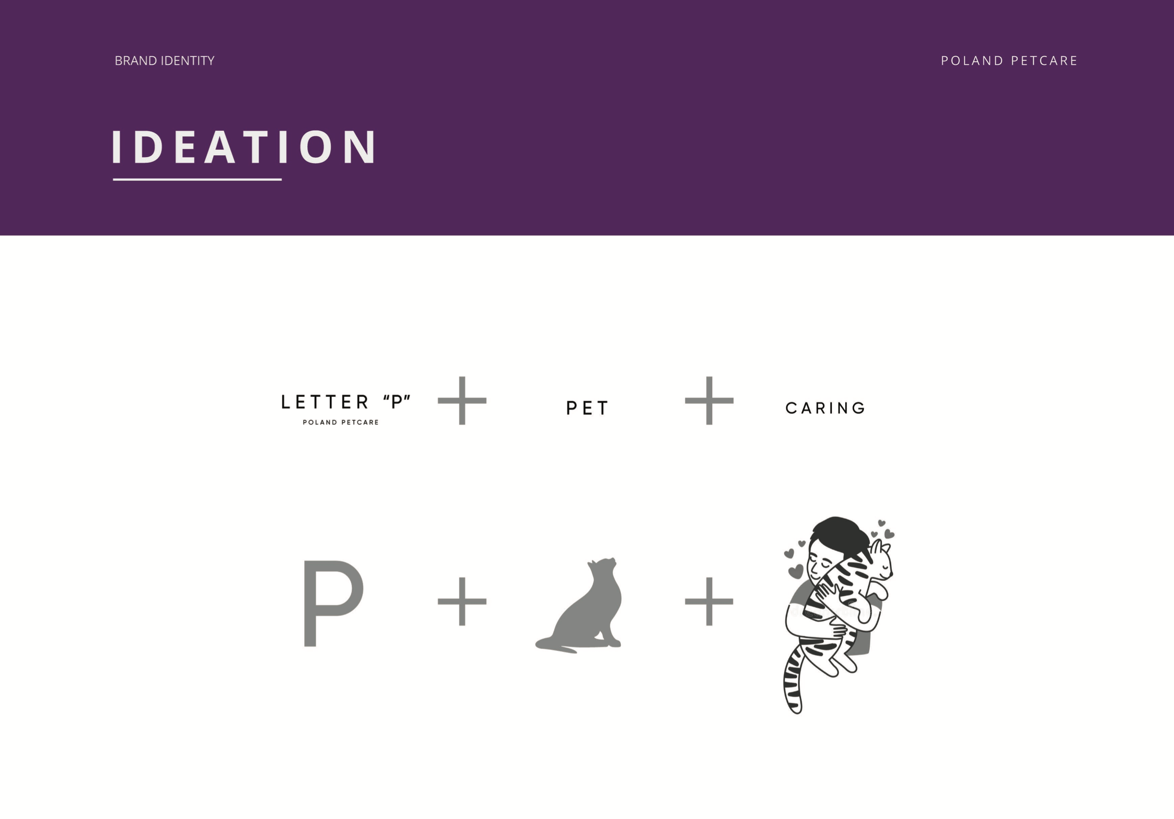
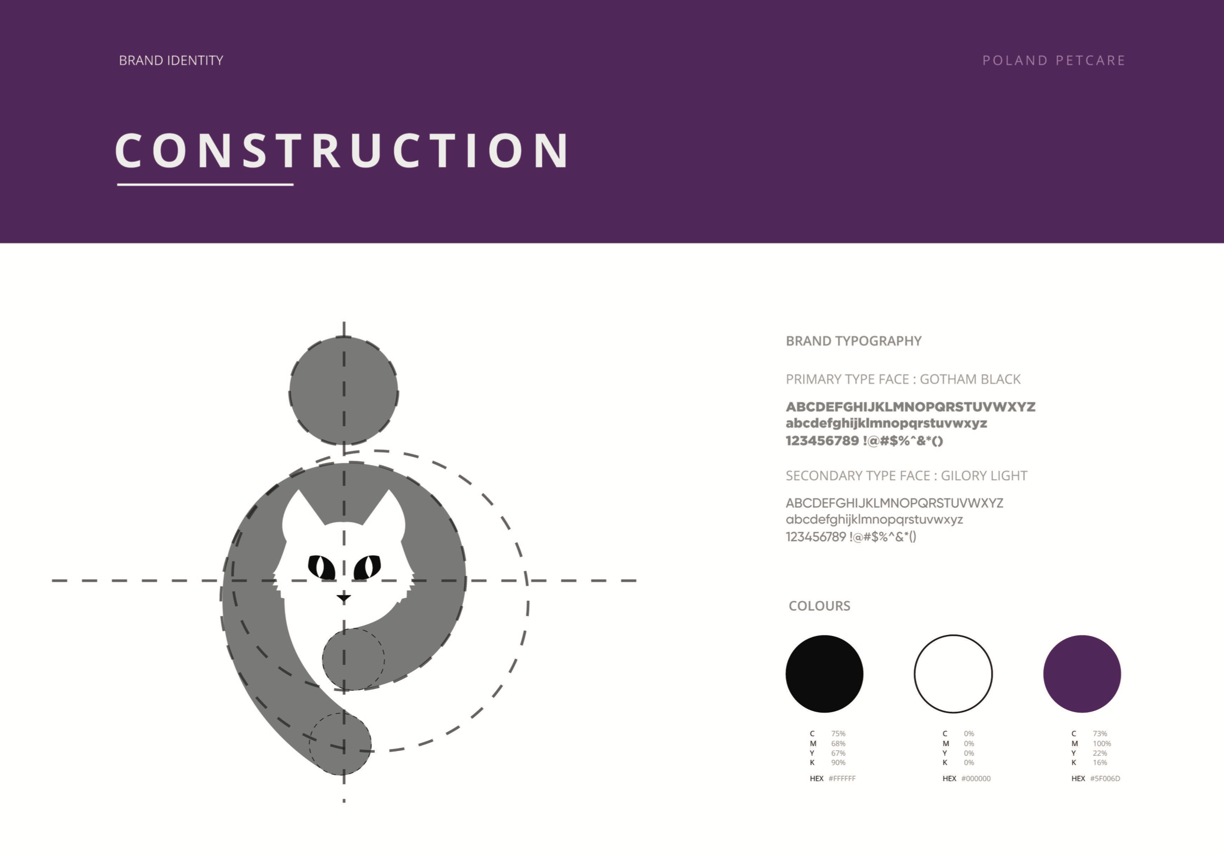
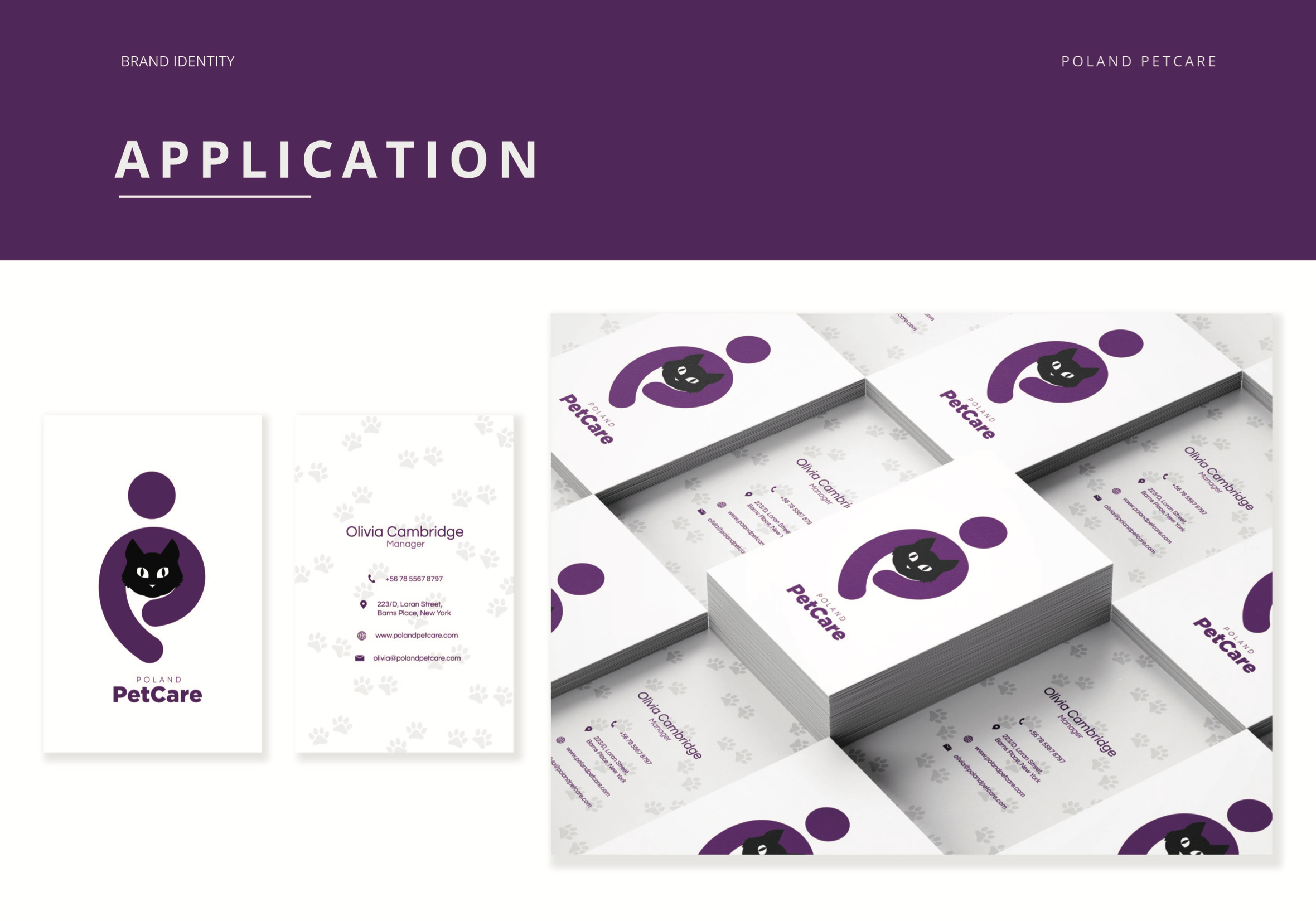
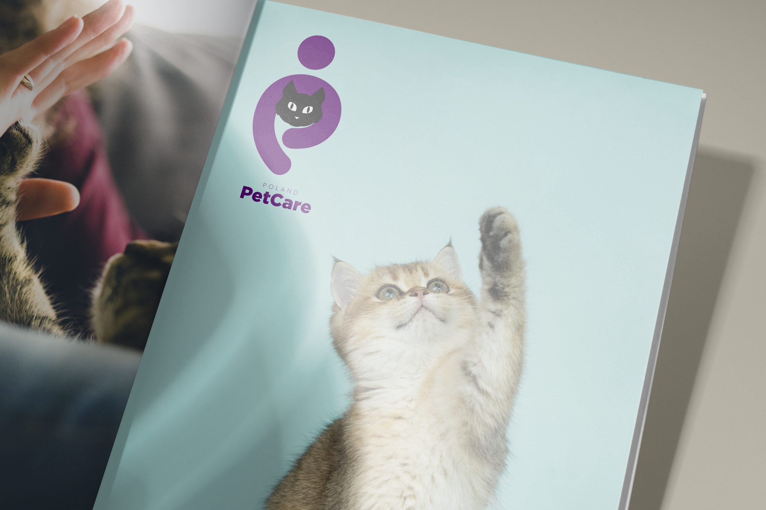
We included a human element in the logo, which was portrayed by showing a man hugging a cat. It fulfilled the emotional aspect by displaying the act of loving and caring. Our team used the negative space technique to bring out the cat in the logo. The client had a certain colour palette in mind, and we included it with a slightly dark scheme for this brand. Our initial research found that the usage of darker colours in marketing was quite popular in Poland. Therefore, considering the geographical aspect, our colour scheme was ideal. On top of that, we also take into account other elements like article publication, magazine ads, social media campaigns, and stationery designing when choosing colours.