Requirements and Brand positioning
For this branding procedure, VEENUS’s main target audience was their existing customers. Their current customer base mostly consisted of mid to high-end customers and attending to their preferences in a novel manner was of grave importance.
Since their products were to be sold online and in stores, the branding should be able to apply to digital as well as printed media. Social media was a key marketing strategy for them, and thus we paid a lot of attention when planning the design elements. The company was entirely focused on female undergarments and making their customers feel special was one of their main objectives.
Designing the logo
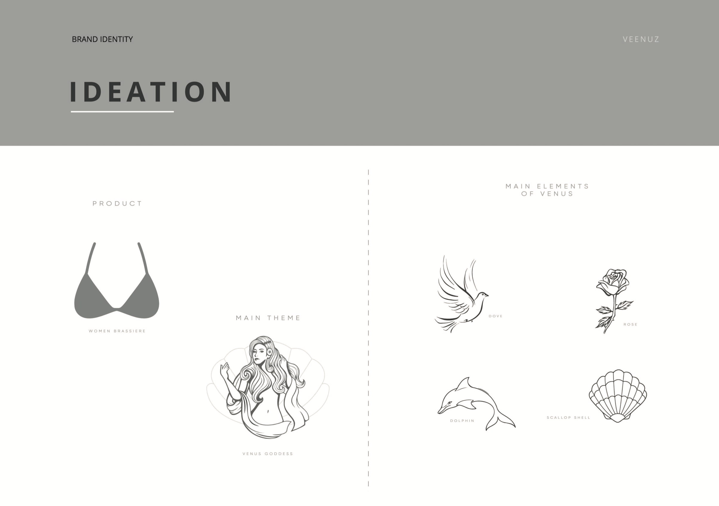
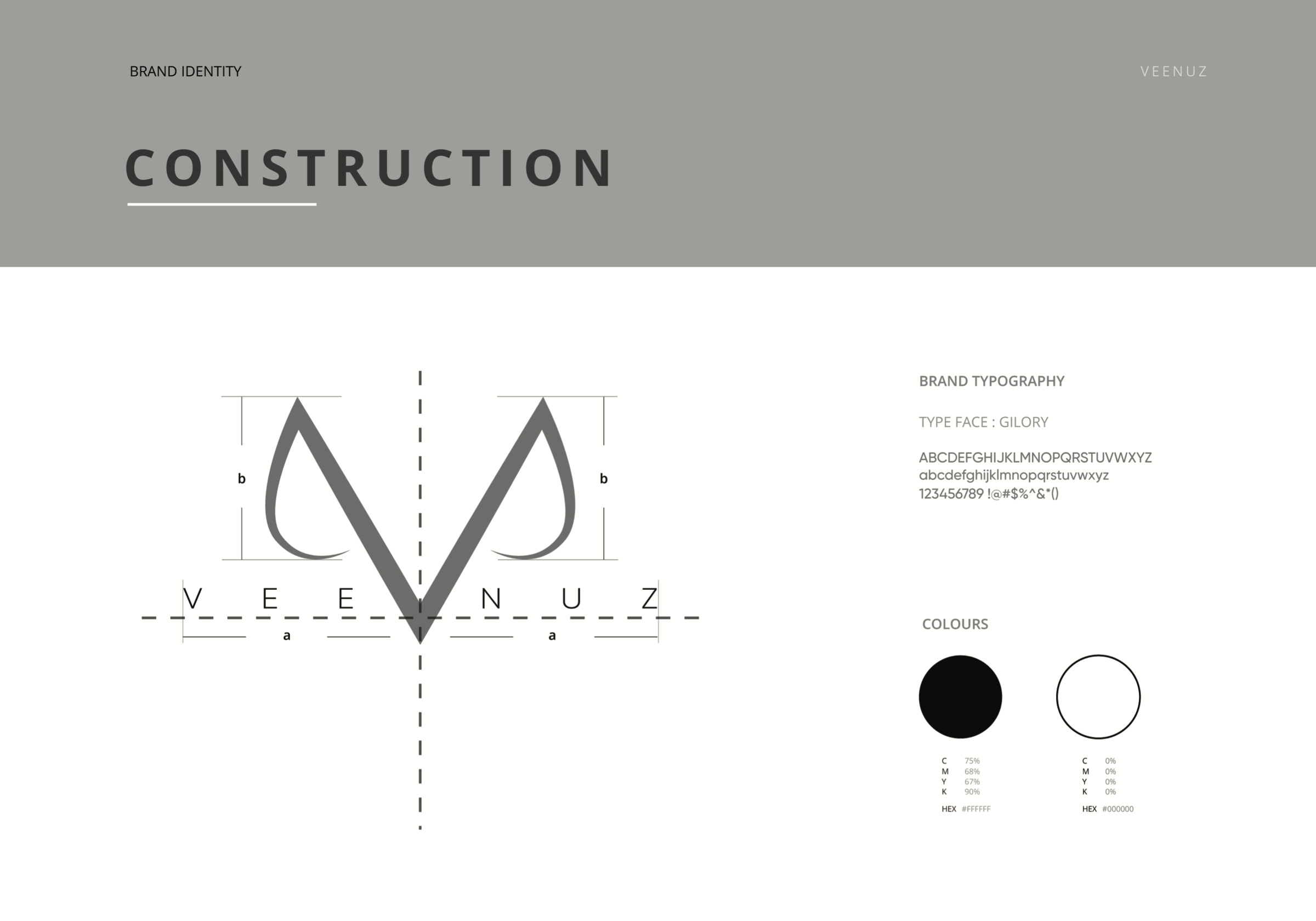
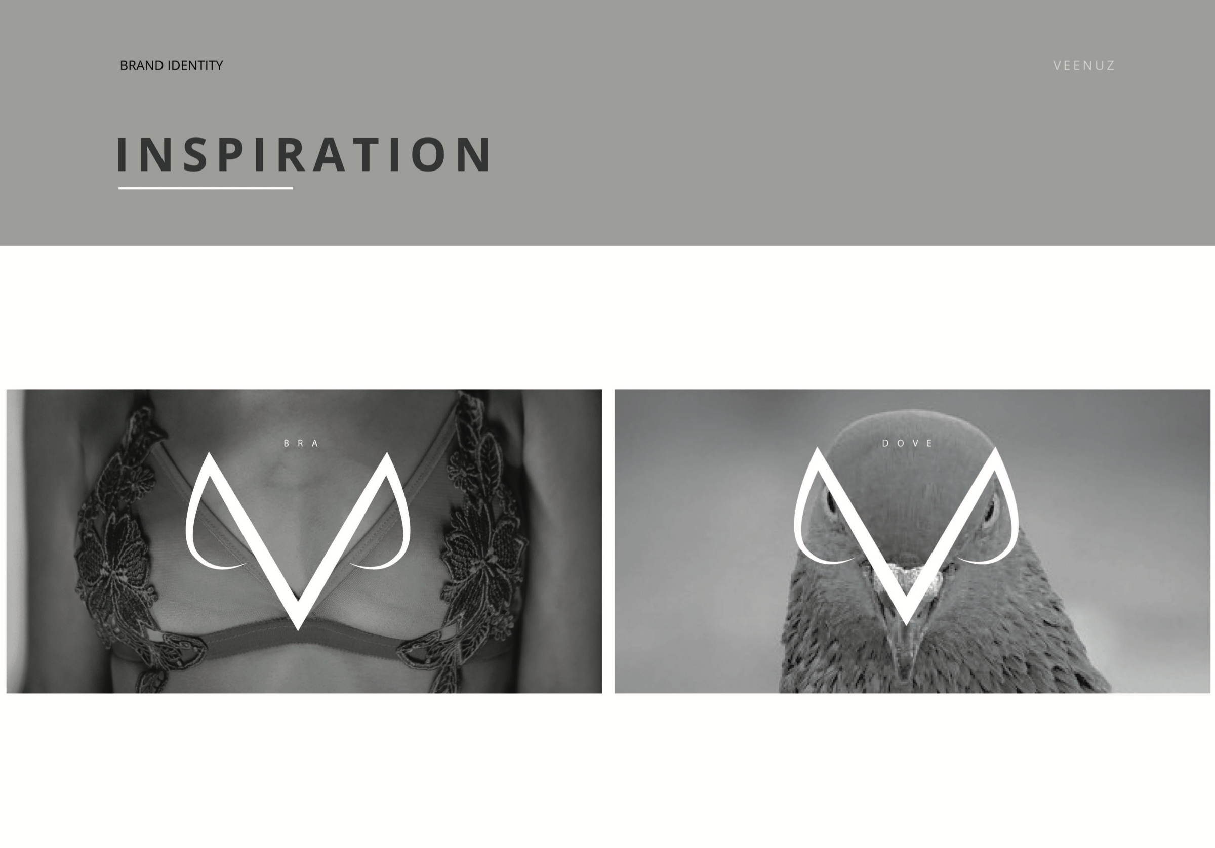
After hours of brainstorming and taking a multitude of factors into consideration, we decided that making this logo very exclusive and easy to remember was paramount. Furthermore, we had to keep sight of the mission of the brand. After weeks of research, we decided to design the logo based on Venus goddess and a dove.
Our team designed the logo with very particular elements, which were chosen very carefully. We considered the shape of the dove and also took inspiration from some types of garments that VEENUS produced. Moreover, the design was inspired by the letter “V,” which clearly is the first letter of the brand name. We were very specific with the colour scheme. After a discussion with the client, we decided to use black and white only.
Applications
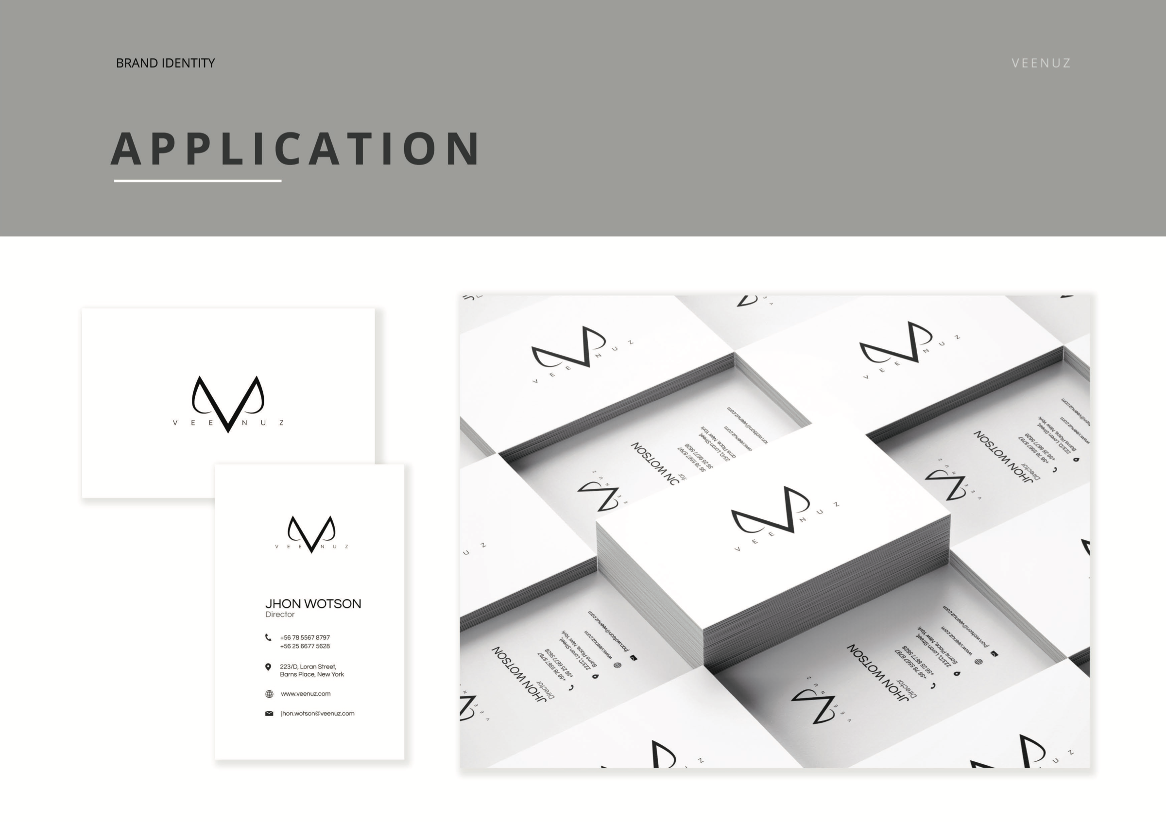
VEENUS is a continuation of an existing brand that has been around for over two decades. Therefore, we had to make sure that every step of the branding process aligned perfectly with the main company/brand. Our team ensured that all applications were flawless. This logo was not only intended to be printed on garments but also other surfaces such as tags, billboards, stationery, and several other marketing materials. Furthermore, we completed their social media and digital media campaigns, for which we utilized a different version of the same logo to help the brand blend better with the respective platforms.